Green Arrows, Dead Brains: A 2026 Autopsy of Your Zombie KPI Dashboard
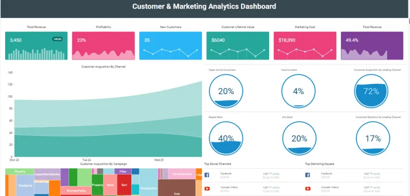
Photo: HelicalInsight OpenSourceBI, CC BY-SA 4.0, via Wikimedia Commons
There is a special kind of horror in a dashboard that looks healthy while the business stumbles toward a cliff. The arrows are green. The charts slope upward. The executive summary uses the word momentum. And yet nobody can explain why cash is tight, customers are grumbling, and the sales team looks like it has been wandering a parking garage for three days.
Welcome to the zombie KPI dashboard. It is not dead enough to ignore and not alive enough to trust. It feeds on meeting minutes, produces no decisions, and occasionally moans when someone asks for a root-cause analysis.
A KPI is supposed to be a vital sign. Too many companies treat it like wallpaper. In 2026, with more data tools than ever and fewer people with time to read them, the risk is not a lack of metrics. The risk is a dashboard full of numbers that are technically moving but functionally deceased.
Symptom One: The Green Arrow That Does Not Feed
Vanity metrics are the classic undead. Impressions, page views, social followers, email opens, app downloads, webinar registrations. None of these are evil on their own. They are context. The problem starts when they are presented as proof of health without a tie to revenue, retention, cash, or customer behavior.
Ask a simple autopsy question: if this number moves 10 percent in either direction, what decision changes? If the answer is a shrug and a fresh bag of coffee, you are looking at a zombie. It may be interesting, but it is not a KPI. It is a campfire story.
The fix is not to ban every soft metric. It is to force each one to earn its place by pairing with an outcome. Page views are fine if they are connected to qualified pipeline. Webinar registrations are fine if they connect to sales conversations that close. A metric without a consequence is just a number wearing a name tag.
Symptom Two: Targets Older Than the Office Keurig
Some targets were set during a different business reality and never received a proper burial. The market shifted. The product changed. The customer moved. The target stayed. Now the team is chasing a number that made sense in a previous era, like a sales rep trying to hit a quota for a product line you discontinued two recessions ago.
A stale target is dangerous because it creates zombie behavior. People optimize for the old number, hit it, and feel successful while the business bleeds somewhere else. Lead volume goes up while lead quality falls. Support tickets close faster while customer satisfaction quietly dies in the waiting room. Everyone looks busy. Nobody looks alive.
Put an expiration date on every target. Review it quarterly. If a target cannot explain why it matters now, it should not be on the dashboard. It should be in the archive with the fax machine and the 2019 strategic plan.
Symptom Three: The Report Nobody Reads
There is a particular sadness to a report that is generated, exported, attached, and never opened. It is the corporate equivalent of a voicemail left for a phone that has been in a drawer since 2021. The report exists. The report is sent. The report is ignored.
Dashboard tabs multiply like rabbits in a haunted petting zoo. Forty-seven tabs. Twelve filters. Six definitions of active customer. Nobody knows which number is canonical, so everyone brings a different spreadsheet to the meeting and the meeting becomes a séance for the truth.
If nobody reads the report, the report is dead. It does not matter how beautiful the visualization is. A dashboard is not a museum. It is a decision-making tool. If it does not produce a decision, it is decoration.
The Triage Plan: Send Your KPIs to the Morgue
Start with a brutal inventory. List every metric on your dashboard. For each one, write down the owner, the decision it triggers, and the last time it actually changed someone's behavior. If you cannot fill in those fields, the metric gets a toe tag.
Next, run a two-week dashboard autopsy. Track which tabs get opened, which numbers get discussed, and which reports get forwarded with actual questions. You will discover that a small handful of metrics do most of the work. The rest are just haunting the place.
Then bury the dead. Not everything needs a funeral with bagpipes. A simple archive folder and a note in the next leadership meeting is enough. The goal is not to delete history. The goal is to stop pretending history is a pulse.
Finally, resurrect a short list of living metrics. Five to seven is plenty for most leadership teams. A balanced diet usually includes cash, customer, operational, and people signals. Cash conversion cycle. Gross margin. Customer retention. Pipeline velocity. Rework or quality rates. Maybe an employee capacity metric that does not require a spreadsheet exorcism. Less is more, as long as the less is alive.
The Resurrection Test
Before a metric earns a spot on the dashboard, make it pass three tests. First, is it actionable? Someone can do something about it this quarter. Second, is it owned? A named human is responsible for watching it and responding. Third, is it timely? It arrives fast enough to matter. A metric that shows up six weeks after the problem is not a KPI. It is an obituary.
Also ask the so-what question out loud. If the answer is vague, the metric is not ready. If the answer is a clear decision, you have a candidate for resurrection.
Do Not Build a Bigger Graveyard
The instinct is to solve dashboard problems with more technology. A new tool. A new integration. A new AI summary that turns your forty-seven tabs into forty-seven slightly more confident tabs. That is not revival. That is embalming with better lighting.
In 2026, the winning move is not more data. It is a cleaner signal. Bury the vanity metrics that never fed a decision. Retire the targets that belong in a time capsule. Stop generating reports that nobody reads. Then build a small dashboard that people actually look at before they make a choice.
Your business does not need a dashboard that looks impressive. It needs one that behaves like a living nervous system. Fewer numbers, sharper signals, real consequences. Green arrows are nice. Brains are better.